CD Projects
I have worked on more than 25 CD projects for language, learning, and speech. One day while proofing a project word list, I noticed that some words looked similar. I started keeping a list.
beach and bench
deer and hear
dot and put
sweater and sweeter
bread and beard
lovely and lonely
sock and soak
absurd and abroad
cantaloupe and camouflage
delicious and deciduous
expect and except
goals and goats
exploration and explanation
identify and identity
natural and neutral
pasture and gesture
tired and tried
calligraphy and graphically
backward and drawback
decimal and medical
The list grew and became the start of my project, Appearances can be Deceiving.
Appearances can be Deceiving
If you try to walk on ice or wet leaves your feet slide or “slip” and you lose your balance. Losing your balance distracts you from what you were doing; all you can think about is not falling.
You can also lose your balance while reading by misreading a word. You must struggle to make sense of a sentence that doesn’t make sense. These “slips” can make it difficult to comprehend the content of the text. If they occur frequently, they slow down the reading rate and overall comprehension.
The “slips” or mistaken identity can be attributed in part to the figure/ground relationship of the words. The figure is the space occupied by the text. The ground is the space around the text and the interior or enclosed spaces created by letters (e.g. the space inside of “q”). Letters that have a similar figure/ground relationship are easy to confuse.
Appearances can be Deceiving is a tool to help individuals become aware of the figure-ground relationship as it applies to text. The graphic below shows how, on first glance, the text in each sample can appear very nearly the same.

Changing an “a” to “e” changes “rad” to “red”; changing “d” to “b” and “o” to “u” changes dog to bug. The letter changes do not greatly change the visual appearance, but they do greatly change the meaning of the text. The switched letters have a similar figure-ground relationship to the letters they are replacing.
Objective Practice differentiating between visually similar letters and words based on their figure-ground relationship. Figure is the text that makes up the words and ground is the area confined by and surrounding the text.
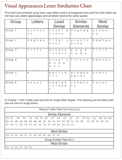
Overview The game has six chapters and each chapter has three parts. The first chapter is based on single letters and letter pairs. The words in the remaining chapters are gradually more difficult. The order is similar to the order of word introduction in reading, spelling, and vocabulary curricula. The visual difficulty is based on the Visual Appearances Letter Similarities Chart. The chart is located at the bottom of the page.
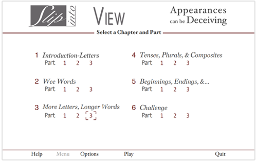
Practice “seeing” the target in progressively more challenging situations. Choose from 12 fonts—all lower case, all upper case, upper-case initial letter of word, and random—most similar to reading text.
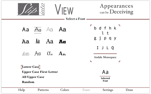
Example of monospaced and script fonts.
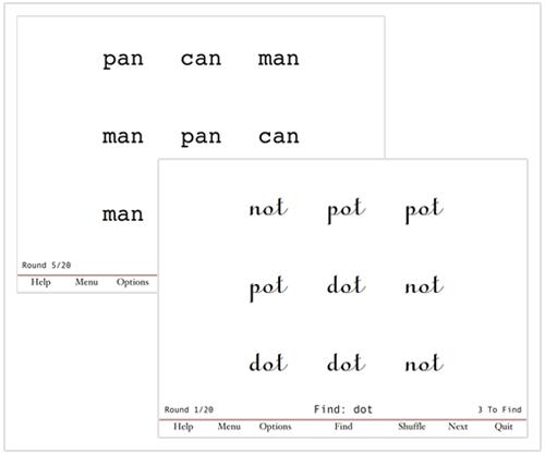
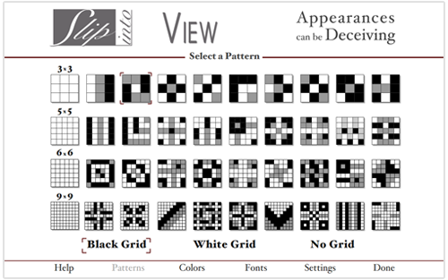
The Appearances can be Deceiving content is laid out in a grid. Each cell of the grid contains either a target or a foil. There are four layout options (3x3, 5x5, 6x6, and 9x9) and three grid options (the stroke around the cells). The cell number corresponds to the number of targets (3 targets in 3x3...9 targets in 9x9).
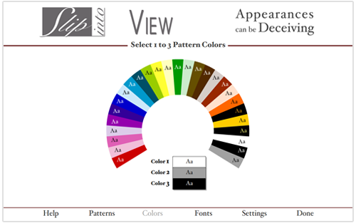
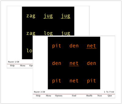
The colors for the background, and three-color patterns are selected from the color menu. When you roll over the color swatch its name appears. Click on a swatch to select it.
Examples of patterns and fonts.
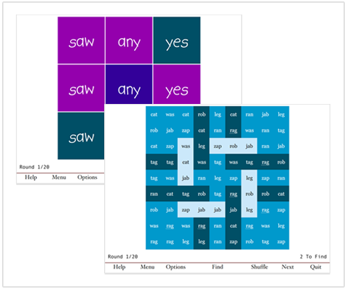
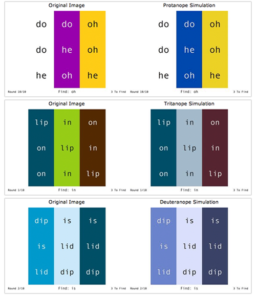
There are several color options for people who have color vision deficiencies.
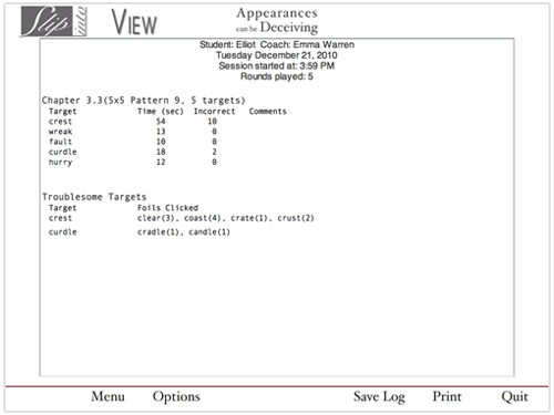
The Results screen lists the details of the rounds played. The graphic shows there were five target words, which indicates five rounds were played. The time each round was played is indicated, and the number of incorrect selections for each target. Two targets were troublesome–crest and curdle. The troublesome foils are listed with their target.
The Visual Appearances Letter Similarities Chart was compiled after viewing the differences in the visual appearances of letters, letter combinations, and words in a variety of fonts.
